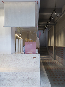
BONUS ICE CREAM

BONUS ICE CREAM

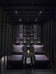
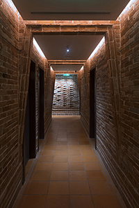
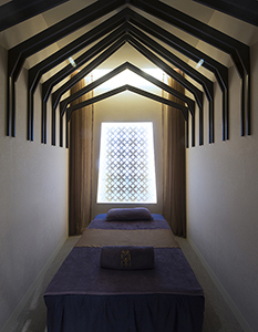
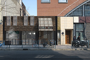
Shanghai \ 2018 \ 66 sqm \ restaurant


The client asks for an ice cream shop that will also become a traditional Cantonese dessert hybrid.


We focused on sensitizing the sensory quality of the materials through the tactile parallels of the ice cream ingredients of white cream, cone waffle, and sprinkles of toppings.


We mediated the overall atmosphere with eaves and linen blinds to evoke a bit more of the Chinese food stall in anticipation of the future Chinese desserts product line.


all images © maos design limited

ORCHID MASSAGE CKYY BRANCH

ORCHID MASSAGE CKYY BRANCH

Shanghai \ 2018 \ 330 sqm \ hospitality


As a continuation of the rebranding of the Orchid Massage branches through cost efficient adjustments, interpretation of the portal and roof elements continues to evolve along the theme of shapes and envelopes.


The types of rooms are further standardized to have a consistent view portal devoid of natural light options.


Note:
The space has since been rebranded as LANN MASSAGE.
maos design is only involved with the design of branches listed on our website.
all images © maos design limited

ORCHID MASSAGE DNGJ BRANCH

ORCHID MASSAGE DNGJ BRANCH

Shanghai \ 2018 \ 270 sqm \ hospitality


As a continuation of the rebranding of the Orchid Massage branches through cost efficient adjustments, interpretation of the portal and roof elements continues to evolve along the theme of shapes and envelopes.


The public spaces are always different for each location and continue to rely on more easily malleable linear elements to define customized envelopes and variations.


The numerous massage rooms transform to adopt planes as the dominant ceiling character.


Note:
The space has since been rebranded as LANN MASSAGE.
maos design is only involved with the design of branches listed on our website.
all images © maos design limited

ORCHID MASSAGE JHQ BRANCH

ORCHID MASSAGE JHQ BRANCH

Shanghai \ 2017-2018 \ 310 sqm \ hospitality


“From limitations come possibilities” is a common recurring story in architecture.


When the local fire code prevented any use of wood and other combustible materials for basement located tenants, this particular Orchid Massage branch had to seek an alternative positioning.


The humble red brick, at its peak of use in Thailand during the Ayutthaya period, offered a source of inspiration, and allowed the opportunity to reinterpret the same explorations in portals and architectural elements to create an ancient kingdom experience.


As one’s mind and body rests, the moments through the space and massage treatment meander between familiarity of the past and the interpretation of the present.


Note:
The space has since been rebranded as LANN MASSAGE.
maos design is only involved with the design of branches listed on our website.
all images © maos design limited

ORCHID MASSAGE ZS BRANCH

ORCHID MASSAGE ZS BRANCH

Shanghai \ 2017 \ 200 sqm \ hospitality


What is the shape of culture?


Orchid Massage, a traditional Thai massage brand based in Shanghai, seeks to re-design and rebrand their new branches with a consistent strategy.


The logo, VI pattern, and VI purple color were kept. Everything else was customized from scratch.


Through an exploration of Thai architectural experiences, Orchid massage re-interprets the envelope of portals and roofs to transport visitors to a serene, Thai world.


The essence is authentic, but the configurations are uniquely articulated, and not mere copies of existing architectural elements from the past.


Note:
The space has since been rebranded as LANN MASSAGE.
maos design is only involved with the design of branches listed on our website.
all images © maos design limited

MLC XIAOLONGBAO

MLC XIAOLONGBAO

Shanghai \ 2017 \ 65 sqm \ restaurant


The xiaolongbao soup dumpling is a highly sophisticated food exemplary of intricate culinary craft.


From the numerous weaving craft used in the food’s steaming preparation grew the research and application of various weaving into walls, imprints, hung screens, and lanterns to create a richness of layers and lightness in a small space.


all images © maos design limited

JGHD NOODLE

JGHD NOODLE

Shanghai \ 2017 \ 70 sqm \ restaurant


The client asks for a locally integrated design reflecting a lot of daily living habits, materials, and objects characteristic of the alley lane housing communities in Shanghai.


We explored the local tendency of dining in stairways and outdoors for many alley lane communities and paralleled that ambiance with re-appropriated everyday objects and furniture in an up-cycle attitude that is actually usable instead of a purely mix-and-match aesthetic.


all images © maos design limited

NIMMAN SPA

NIMMAN SPA

Shanghai \ 2017 \ 225 sqm \ hospitality


How do you instill cultural specificity besides transplanting traditional motifs?


When Nimman Spa wanted to create a contemporary Thai spa for the younger generation different from traditional spaces, we convinced the client that modern Thai design does not mean just mixing in contemporary furniture within old Thai houses, like the many cafes along Nimman street in Thailand.


Instead, we created a key pattern with inherent Thai proportional tendencies, and used it to establish an overarching cultural ambiance from which objects, furniture, and details can evolve from and materialize into a total spatial experience.


We believe culture in the contemporary meaning is not defined by one element, but always between familiarity and surprise.


Note:
The space has since been rebranded as LANN SPA.
all images © maos design limited

EXPLORIUM RETAIL LAB

EXPLORIUM RETAIL LAB

Shanghai \ 2015 \ 2500 sqm \ retail


Explorium is a retail center focusing on children’s clothing brands, learning workshops, and interactive playing spaces.


Using the specified brand colors and following the instruction to not alter the existing wall and ceiling profiles, Explorium’s entry and public spaces are given a clear identity color swath to unify the brand’s platform from the different retail brands and tenants.


all images © maos design limited

PH PLUS SHANGHAI CENTER

PH PLUS SHANGHAI CENTER

Shanghai \ 2015-2016 \ 220 sqm \ restaurant


When a chain restaurant wanted to create an upgraded side brand, we sought to blur the brand recognition not from the logo recognition but from the experiential meaning.


The logo and brand reflected two key elements, color and space type, and we re-interpreted exactly that to create a consistent yet refreshingly new experience.


all images © maos design limited

error: Content is protected.