PH PLUS SHANGHAI CENTER
Shanghai \ 2015-2016 \ 220 sqm \ restaurant
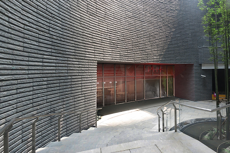
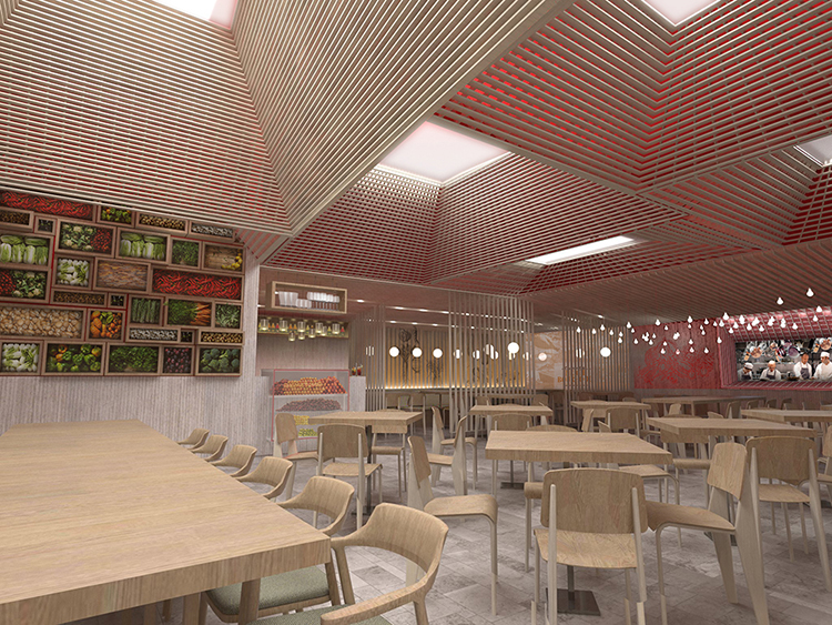
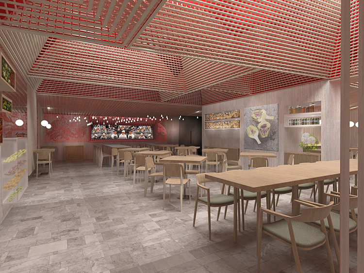
When a chain restaurant wanted to create an upgraded side brand, we sought to blur the brand recognition not from the logo recognition but from the experiential meaning.
The logo and brand reflected two key elements, color and space type, and we re-interpreted exactly that to create a consistent yet refreshingly new experience.
all images © maos design limited


